Recently I’ve started running again.
It’s been a while since my knee pulled me out of the Brighton marathon after just 10 miles (at which point I was out in the middle of nowhere-dean and had to walk a further 2 miles back into town! 🙂 )
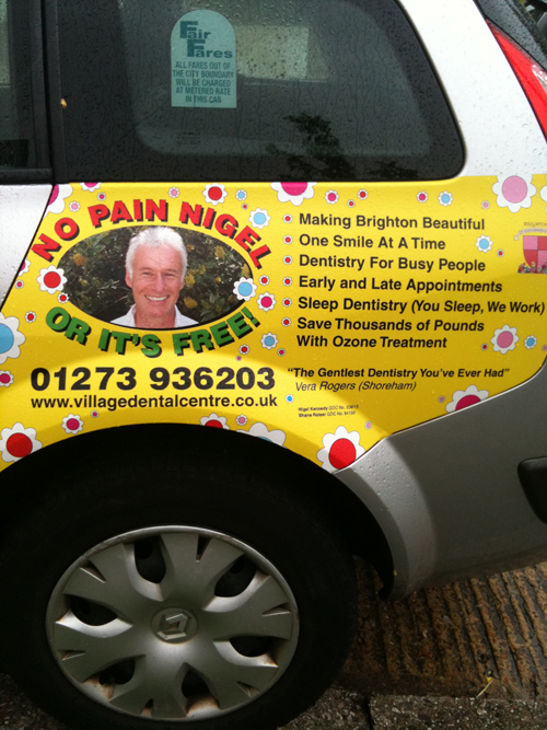
Running is great for giving me new copywriting ideas and marketing thoughts, but it doesn’t usually happen in the form of a “hit you in the face” obvious inspiration as this:

So why do I love this and what lessons do I think you can use in your advertising?
ONE: Run away from the crowd
This is not your typical Brighton dentist office advertising
Instead most dentist offices near here follow each other by using anonymous model smiles, clipart smiles and commonly used green and blue hues.
The yellow of this advert caught my eye almost before I was round the bend (I’m talking running here. I haven’t had a breakdown for weeks 🙂 )
It also uses a real person, not just anyone, but Nigel himself. He has the confidence in his work to be the expert and personality of the business.
As a result we feel we know him.
Hop over to his website and there are plenty of videos to help you get to know him better. Not to mention video testimonials, strong guarantees and awards.
Did someone say know, like and trust?
I’ve no doubt other dentists in the area feel this isn’t really how you “should” advertise, but following the crowd isn’t always the best lesson when marketing your business.
TWO: Big promise. BIGGER guarantee
No-pain dentistry tackles one of the biggest objections we have about going to the dentist.
But this isn’t like when a doctor tells you it’s not going to hurt (they always lie) because Nigel is putting his money where his gleaming mouth is by offering you your money back if he doesn’t achieve this.
That’s a bold guarantee!
THREE: Bold, succinct benefits
There is limited space for copy on the advert, and this is where many local businesses write vague promises and taglines that every other company seems to use.
No Pain Nigel is specific, succinct and talks directly to the desires of his audience for example:
- Dentistry for busy people – early and late appointments
- Sleep dentistry (you sleep, we work)
- Save thousands of pounds with ozone treatment
Now, I think something a bit more specific about the ozone treatment would have been good. I don’t normally spend thousands at the dentist, but if they could illustrate a bit more on the savings, this could be more compelling. For example:
“A £2,700 procedure at other dentists is reduced to £200 with our Ozone Treatment”
That would intrigue me (if it’s true of course – I’ve just made that point up as an example).
FOUR: A useful testimonial
There’s no fluffy “would highly recommend” or “brilliant – thanks” testimonial on this advert. Nope, Vera, from Shoreham (am playing a gig there in a couple of nights) gets right to the point of our fears of any man with a drill coming towards our mouths:
“The Gentlest Dentistry You’ve Ever Had”
Awesome.
Now if I wasn’t happy with my northern dentist looking after me gnashers, I’d definitely be keen to give No Pain Nigel a go!
What do you think? Do you like his ideas? Can you see how you could use specific benefits in your advertising? Is it “too much” for you?
Get your teeth stuck into the comments below!

It’s rare tht business owners narrow the focus of their message to address the exact concerns of their market with precision. Nice work! I like your tag line.
Thanks for posting this!
Great advertisement indeed. It didn’t beat around the bush. It didn’t make any false claims or promises. There are testimonials and some things to back up his excellent work.
I’m pretty sure this post should be bookmarked by most of the newbie copywriters and use it as their guide when they write their sales copies, sales funnel and etc.
Thanks! 🙂
Amy, thanks for the breakdown. Really enjoy this kind of thing!
I’m wondering if you think, though, that perhaps the whole thing is too cluttered with detail. Especially for a taxi, which in most cases would be moving. And also because the ad is tightly packed into the car’s rear quarter panel and not, say, spread across the side of the car where the type could be larger.
I wonder if it would be stronger if it were edited down to essential benefits–only bullets 3, 4 & 5? Then font sizes of bullets and the testimonial could be made bigger for greater visibility.
Love to hear your thoughts. Thanks!
Hey Eddy!
Excellent points.
I think for Brighton, it’s not a bad strategy because taxis can’t be flagged down on the street, that means unless they’re on a job, they’re parked in ranks (rather than driving round looking for people to pick up).
But I agree, I would probably get rid of “making Brighton beautiful one smile at a time” because it’s not as strong as some of the other benefits.
Great ideas 🙂
That’s genius – talk about standing out from the rest of the stiff white-coated brigade!! Well spotted 🙂
Great fun isn’t it!
Hi Amy,
Great post, the point that stood out for me the most was how Nigel had addressed the biggest objection in such a straight up way, genius! It’s definitely got me thinking about how we can improve this in our sales copy. I’m writing some copy today for a new product we are launching soon and I will definitely be referring back to this post for a bit of inspiration.
Great post!
Janine
Hey Janine!
I know – bold eh? I also like how he’s tried something new. Advertising on taxis like this is also quite unusual in this area. Refreshing!