If you’re a small business owner deciding between hiring someone to design and set up your website, or taking a course to do it yourself, this review of Wendy Cholbi and Pamela Wilson’s Site Setup Kit should help.
It’s an online tutorial that can either teach you how to go from nothing (no website, no hosting) to a well-designed and branded website (using the Prose theme on Genesis framework – included in the cost!).
Or (as I did) you can use it to give your existing website a face lift. 
Just the Facts Ma’am
For those in a hurry. (Scroll down for full review)
What is it?
An online tutorial (and very useful forum) for setting up (from nothing) and designing a good-looking WordPress website on the Genesis Framework and the Prose child theme.
Who is it for?
Small business owners who want an affordable, professional website but find graphic design and technology frustrating.
Who is behind it? 
Wendy Cholbi and Pamela Wilson. Wendy translates tech jargon so you can follow it easily, and Pamela delivers simple step-by-step design lessons that work even if you don’t think of yourself as artistic (I’m in that category).
What level of ability do you need?
I have zero design or coding skills, but I’m pretty good at following instructions.
Wendy and Pamela spell out every single step in their tutorials. Their lessons are clear, easy to follow and tone of voice is personable. They don’t skip instructions because they assume you should know something, but they don’t patronise either. They are super friendly, helpful and passionate about helping business owners with this course.
Would I recommend it?
In a heartbeat. This is a very rare program in that after the very low investment in the program, you can get create a site that might otherwise cost you $1,000s for a designer to do.
Also – one thing I loved about this was I could directly control the design and function. No back and forth emails to a designer or developer trying to explain what it was I wanted. I could create it all myself.
What’s inside?
There are 5 main modules and I’ll walk you through in a bit more detail the modules I used. Ultimately you get:
- Module 1: Getting to Know WordPress
- Module 2: Planning Your Website and Getting Started
- Module 3: Customizing Your Site and Making it Sing
- Module 4: Designing Your Site
- Module 5: The Finishing touches
- Bonus Materials
- A VERY helpful forum
How much is it?
$297, and currently they offer payment plans.
This is unbeatable value when you see what you can do…
How I used Site Setup Kit on my website
The background
Last year my website crippled my ability to publish regular content. My blog pages were difficult to read and I couldn’t create fast and polished pages for promotions and services. I had a custom design that I loved, but after 3 years of my own personal tweaking, my site was clunky, difficult to use and not-so-professional looking.
I need to modify my website as my business evolves but something was going to break (and my brand would look shabby to prospects).
I couldn’t give it a quick polish: I had to start again.
Here were my choices:
- Hire a designer to redo my site (Fear: Spending LOTS of money and losing direct control)
- Find some course, new theme, new design that would let me do it myself. (Fear: Spending LOTS of time and messing it up)
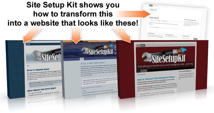
It took me one day to transform my site from one of those circus cars where the door’s about to fall off, into what I think is a pretty neat run-around with improved design, usability and conversions.
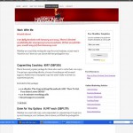
Here is the homepage when I started thinking about a redesign:
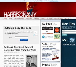
There was plenty that I didn’t like on the site. Nothing to do with the original design, but the workaround customisations I’d added over 3 years:
- 3 sidebars no longer worked for me but my custom design meant I couldn’t just switch easily to 2
- The “feature box” (Authentic copy That Sells) didn’t look right and wasn’t converting
- I couldn’t add items easily to the sidebars because I couldn’t match the custom design style
- I wanted a static homepage rather than showing my blog posts.
Now, even though you get Genesis and Prose as part of signing up to this, I’d already purchase those and had begun trying out free tutorials to see how far I could get (answer – not very far).
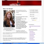
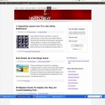
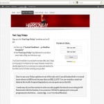
If you want to see images of what my site looked like BEFORE Site Setup, click on the gallery below (before I started, I’d changed my homepage to a static page which is why it looks different above):
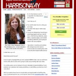
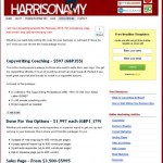
And here are the current AFTER shots:
The biggest changes included:
- Customising my header to update my tagline and include logos
- Choose new fonts and have them consistent throughout the site
- Create a custom, textured background to make the site stand out
- Use an accent colour on sign up boxes to highlight them
- Change the colour of my links and make them consistent
- Adding footer sections to my home page to promote my services
- Using font colours to make my headers and sidebars stand out
This is only in the early days of my redesign, but already I’m seeing a greater consistency in design, and better way to present my content clearly and professionally.
Getting Started in Site Setup Kit
Wendy and Pamela really do start you from the beginning.
There are 2 main options of how to start when you log in:
I was just interested in the design aspects. However, if you are starting at the beginning, they provide resources that help you understand how to:
- Purchase a Domain Name
- Get Web Hosting
- Point your domain to your web hosting account
- Install WordPress
And once that’s done you can move onto the bulk of the course starting with:
Module 1: Getting to Know WordPress
In this module you look at:
- A tour of the WordPress Dashboard
- 5 essential settings for WordPress
- All about Pages and Posts
- What you need to know about Plugins
- What you need to know about Widgets
- How to upload images
I was pretty familiar with the WordPress dashboard, but I went through this module for anything I might have missed.
Wendy and Pamela include images along with instructional text so that you can identify each part of the dashboard that is going to help you run your site. I also knew how to create pages and posts, but I could recognise that this module was really well laid out for someone with zero knowledge of these.
I did find some new gems in their recommendations for widgets and plug-ins that I didn’t know about.
Overall, perfect for newbies, and worth a quick recap if you’ve been using WordPress for a while.
Module 2: Planning Your Website and Getting Started
In this second module, the tutorials take you through:
- Installing Genesis and Prose
- Planning your website
- Choosing a design theme
Because Wendy and Pamela personally use websites to run their businesses, the planning information is practical and just enough to get you up and running.
I was also very impressed that the kit comes with 10 possible design styles, more than enough variation to find one to suit your business.
10 is just enough so you don’t get overwhelmed with choice. And with the level of customisation possible, it doesn’t matter how many people choose the same style as you, all the sites will look different.
Module 3: Customizing Your Site and Making it Sing
In this module you look at:
- Custom Menus in Prose
- Creating a Custom Header
- Inserting a Custom Header Image
- Genesis Plugins
- The Landing Page Template
Now I’d noticed that WordPress had introduced something called custom menus and I had no idea how to use them.
This module opened up a world of possibility with custom menus. By having someone take me through them step-by-step I have a solid understanding of how to get the best from them.
I’ve used custom menus to change which sidebars are shown on certain pages (such as the homepage) and I also have the ability to have a dual navigation bar (one above and below my header image). As I’m still in the process of reshuffling site pages, I don’t need to use this just yet, but will know how to do it when I am!
The custom header was important to me. I kept the one designed by Men With Pens, but for the first time ever I was able to tweak it so that it looked how I wanted:
Here it is BEFORE:
And here it is AFTER:
I was able to change the tagline very easily through a tutorial that Pamela delivers, and it’s something I would never have been able to do on my own.
I could also move the logos of places I’ve been up into the previously wasted space of my header.
The one thing I found a little tricky, is that creating a custom header comes before you choose the colours for your site. I already had mine, but if you’re starting out, I’d recommend choosing the site’s colour palette (in module 4) before you design your custom header image.
Module 4: Designing Your Site
Okay, this is the module where I saw the biggest changes.
What surprised me most is how getting a few things very right when it comes to your design can transform the look and feel of your business website.
Throughout this module you get to:
- Create Your site’s Colour Palette
- Choose Background Colours and Images
- Use Distinctive Fonts for Your Site
- Making the Most of Images
- Multimedia, Audio, Video and PDF use
- Changing Site and Sidebar Width
It’s this module that makes your site unique.
I loved choosing my colour palette, and it was amazing at how picking 5 simple colours could affect the design.
You choose 2 main colours (mine are the deep red and dark blue) then 2 background colours (I have a light blue and a pale grey) and an accent colour (the yellow you see around my notice boxes and sign up forms).
Wendy and Pamela show you how to choose your colours and decide where to use them (header text, link colour, subheadings etc).
Getting this right made gave my site a more professional appearance.
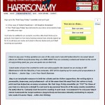
Look at these subtle comparisons:
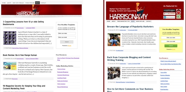
For me, this was worth it’s weight in gold.
Everything started to work together. Before it had felt like one patch on top of another whenever I tried to get involve in designing something new for the site.
This ability to really understand how design affect my branding has given me huge confidence in planning my marketing.
Module 5: Polish and Launch
At this stage, I was mostly done and having fun playing with my site, tweaking and tinkering (which I will continue to do). But there are a couple more elements that Wendy and Pamela provide if you need them including:
- Adding a Favicon
- SEO Made simple
- Tips for consistency
Bonus Materials
There are plenty of bonus materials.
- Style Warehouse (your 10 designs)
- CSS Snippet Library – for shortcuts to more complex customisations
- Prose Cheat Sheet
- Your Website Style Guide
The Prose cheat sheet maps how the dashboard controls links to your site design. If you want to tweak something, you can look at a layout of a website template and find out which dashboard setting controls it. Genius time saver.
The style guide which logs all of your file names and colour codes so you have a quick reference to all of your foundation design elements which saves time and builds consistency when you’re designing any new materials.
Try Wendy and Pamela’s Content for Free:
This is a high-quality, budget-friendly product. I use affiliate links, but if you want to purchase the product through a non-affiliate link you can do so here.
I only recommend products I’ve used. This review shows you how the course helped me change the look and feel of my website, including before and after shots.
If you’re interested but want to test out Pamela and Wendy’s content for free first, there are 2 options to suit you:
Free Love Your Website Mini-Email Course
A free 9-part email course that explains:
- What is web-hosting,
- How to choose a web host
- How to pick and register a domain name
- The tools and know how for polishing your site design
Click here to register for the mini-email course.
Free Love Your Website Class
An on-demand (watch when you want) online class that explains:
- How to get your website on the web
- The easiest free software for creating a website
- How to have simple control over your website’s design
To register for this free class at a time that suits you, click here.
Summary
In short, I highly recommend this resource. Like I say, it took me a day to really turn my site around, with a few more hours here and there tinkering and tweaking.
The main results I’ve noticed include:
- Increase in daily subscribers to my newsletter
- Improved search engine traffic (probably because I’ve been able to publish content more easily)
- Increased productivity – creating a new page of web content or changing the navigation doesn’t take as long as it used to.
Overall this is an excellent resource to have if you are a small business owner in charge of your site.
If you’re someone who wants to keep control of the look and feel of your site, but don’t want to spend days lost in the frustration of trying to make graphics or technology work, I’m confident you will love this.
