Yesterday I was eating cereal at my friends’ place because I had once again over-stayed, slept in their cellar, eaten their cheese and crackers and emerged in the morning somewhat hungry to drink their coffee (I’m an excellent guest).
It was too early to eat their “best-overs” (best leftovers in Brighton) so I was standing in the kitchen, eating cereal instead, trying not to interrupt my friend as she studied for her PHD.
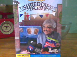
And the only thing to hand to keep me amused whilst I munched away through my Frosted Shreddies was this:

And within 2 mouthfuls I was bored.
But I kept staring, and flipped the box around on the side panels to see if there was anything else I could read. Apart from the nutritional information, (which includes the calories – not fun), there was little else of interest and I couldn’t help but feel that Nestle have been a bit lazy in the design of this cereal box.
Think about it, how many bowls are in that box? 7? 8? You or your children could be staring at that every morning for a week.
How much would you pay to get your customer thinking about your business for 15 minutes every day for a week?
Is it because they don’t have to pay for this advertising space that they’re wasting it?
If Nestlé were paying thousands of pounds for an advert in a magazine do you think they would have spent more time crafting something that really reinforced the benefits of Shreddies to its customers?
So what else could they have done with it to encourage their customers to keep returning to Shreddies?
Written a story
Give me a story about the adventures of the “Nannas” who knit the Shreddies, even better, create a series of stories, say 10, so when you go to the supermarket next time, you choose another box of Shreddies with a different story, or the next story in the series.
Reminded me why I bought the cereal
Give me some information about all the wonderful things about Shreddies, how they’re made, how they’re different. Leave me with no other impression that I did the right thing when I parted with my money for their cereal.
Told me what else I might like
Let me know about your other products, your other cereals or cereal bars, or breakfast snacks that I might think about next time I’m in the cereal aisle.
Just give me something to read when I’m eating my cereal.
Now, is there a bigger reason behind using a big picture rather than using this valuable advertising space? Am I missing something or is their marketing department just lazy (or wacky) in thinking that long copy is boring and useless?
Or, even worse, do they think that once the first sale is made, no more effort is needed to keep that customer coming back?
What would you include in the design if that cereal box represented your business?
Are you wasting “free advertising” space on your own blog or current marketing materials just because you don’t have to pay to advertise your services there?
Next week I’m going to do a copy overhaul of my site and see if there’s any wasted space that I can be providing better value for you my lovely readers. I’ve got a few ideas, but if anyone sees the equivalent of the back of this cereal box on my site, please let me know.
Love to know your thoughts in the comments.
And have a weekend filled with lie-ins or early starts, leisurely play or hard work getting ahead, and make sure you find something to make you laugh.
See you next week!
[…] This post was mentioned on Twitter by Amy Harrison, Amy Harrison. Amy Harrison said: RT @littleunred Is this big brand getting lazy? http://bit.ly/crezVW […]