After 7 years without one, last week I did something pretty exciting.
I bought a TV.
I can’t quite remember why I stopped having a TV, it wasn’t a big statement, and with so much on-demand entertainment possibilities it has become less and less odd to people (though not to my friends who now excitedly text me their favourite shows so I can join in with them ‘live’.)
I love it.
And it perfectly epitomises how overloaded we are with sources that are competing for our attention:
Stay tuned… Coming up next… When things took a dramatic turn… See this exclusive turn of events only on…
Sound familiar? It’s the same cry for attention our content marketing has when trying to reach potential customers. Straight away it made me think about my drama teacher telling us about scripting scenes and telling engaging stories:
“You’ve got to imagine someone is flipping through the channels, looking for something to watch. What do they do? They give it 2 seconds and then decide if they’re going to watch, or if they think ‘shit’ and click to the next channel. To get their attention, you have to beat the ‘shit, click’ syndrome.”
When I work with clients on their website copy we talk about having that same immediacy of engaging information.
Last time on the blog we looked at how to write your business homepage with confidence. Shortly after I held a Live Copywriting Lab where I did live reviews of people’s business homepages. The overwhelming thing that I noticed while reviewing copy was that:
There are so many great businesses out there that deserve to be heard.
The Live Copywriting Lab turned into a bit of a whopper session, and until Tuesday 2nd June you do have a chance to catch the replay. Today though I wanted to share a couple of specific tips that you can use in your home page copy to help you beat the ‘Shit, Click’ Syndrome and get more eyes on your copy.
1: Use a knock-out quote (from a customer)
Katherine is a savvy business lady who offers smart business advice to interior designers so that they have more time, freedom and control to focus on the creative, fun aspects of their business.
As with many home pages that I see, Katherine focused on the services that she offered in her home page copy, and had a neat quotation from Steve Jobs: “Design is not just what it looks like and feels like. Design is how it works.”
Smart guy who knew a thing or two about design. But do you know who knows a thing or two about recommending Katherine to enquiring prospects?
Past customers.
Scrolling down the site I see a testimonial near the bottom:
As interior designers, we forget that by improving the way you organize the way you work, it can allow you more time and energy to be creative. I did not realize that having a specific system in place for tasks could reduce my stress and add to my credibility with clients.
There are some very clear benefit statements in there, and if it were me, I’d clip this quotation, or ask the customer if I could tweak it to be displayed prominently at the top of the page:
Having a system in place for my business tasks reduced my stress and improved my credibility with clients.
Suddenly you have this mini-headline that is vouching for your business. Not unlike the testimonials you see on trailers and cinema posters: Laugh out-loud! 4 Stars! So creepy I hugged a stranger! etc.
So here’s what I want you to do, go through your testimonials and try to find that 1-2 line nugget of ‘wow’ that someone has said about you. Display it prominently on your homepage and add it to your arsenal of home page copywriting weapons.
2: Have a proprietary promise…
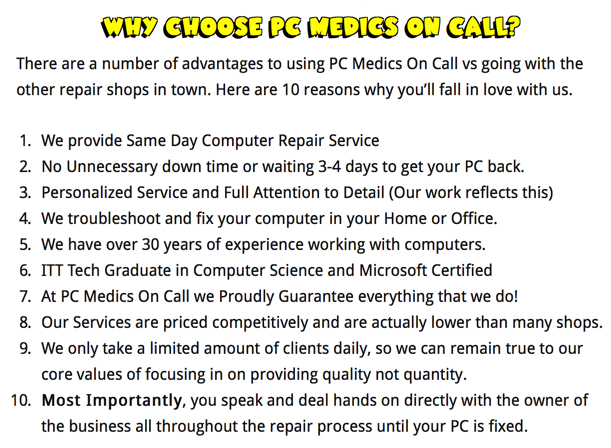
One of the other home pages submitted for review was PC Medics on call. One of their biggest selling points is that they did same-day, on-site repairs. As someone who was without a computer for 5 days as it was repaired (we no longer talk about accidental-liquid-spillage-gate as it’s come to be known.) I recognised that this was an invaluable service.
And here’s what I loved on their homepage copy: scroll down a little and you were presented with this:

Not only is it answering the very question a prospect has in their mind when they visit your site:
Why should I care? Why should I listen to you?
(And believe me, your visitors are asking the same thing), but it sets the business apart and makes them sound unique because they’re outlining exactly how they work.
Not many computer places do that? They might write about the services they offer, but they don’t realise that adding that level of HOW you deliver your service builds confidence and trust.
And you know how PC Medics could make this even more powerful and persuasive?
By turning it into a proprietary promise
Make a list of 5-10 things you do with every single customer, for example:
- 1:1 consultation
- First draft within a week
- Ongoing email support
- Emails answered within 4 hours
- 1 set of reviews
- Fixed price
And list them out as a promise that your business makes to your customers. For example:
The ACME 501 point checklist for catching a road runner…
Okay, I joke, but what about:
PC Medics 10-Part Customer Promise
ABC Web Designs 21-Step Customer Guarantee Process
XYZ Hotel’s Happy Night’s Guarantee
This clever piece of positioning does a couple of things:
- Makes you look professional – you look as though you have taken the time and effort to develop a plan
- Shows you care about customers – each one of the points is focused on a benefit the customer will experience
- Sets you apart – imagine your customer talking to a competitor and finding out they don’t offer a standardised, laid out customer promise of some kind
Okay, 2 tips you can use straight away, now we’re onto the final quick tip of…
3: Outline the profile and problem quickly
This is a very simple way of saying that in your home page copy, that what should be evident within seconds is:
WHO you help
What PROBLEM you solve
And I’ll be honest, I’m talking about describing this in very simple terms. Your who might simply be:
- Interior designers
- Computer owners
- People who want to write a book
And problems may be:
- Struggling to run a business
- Having a virus or having their computer hacked
- Not knowing how to structure a best-seller
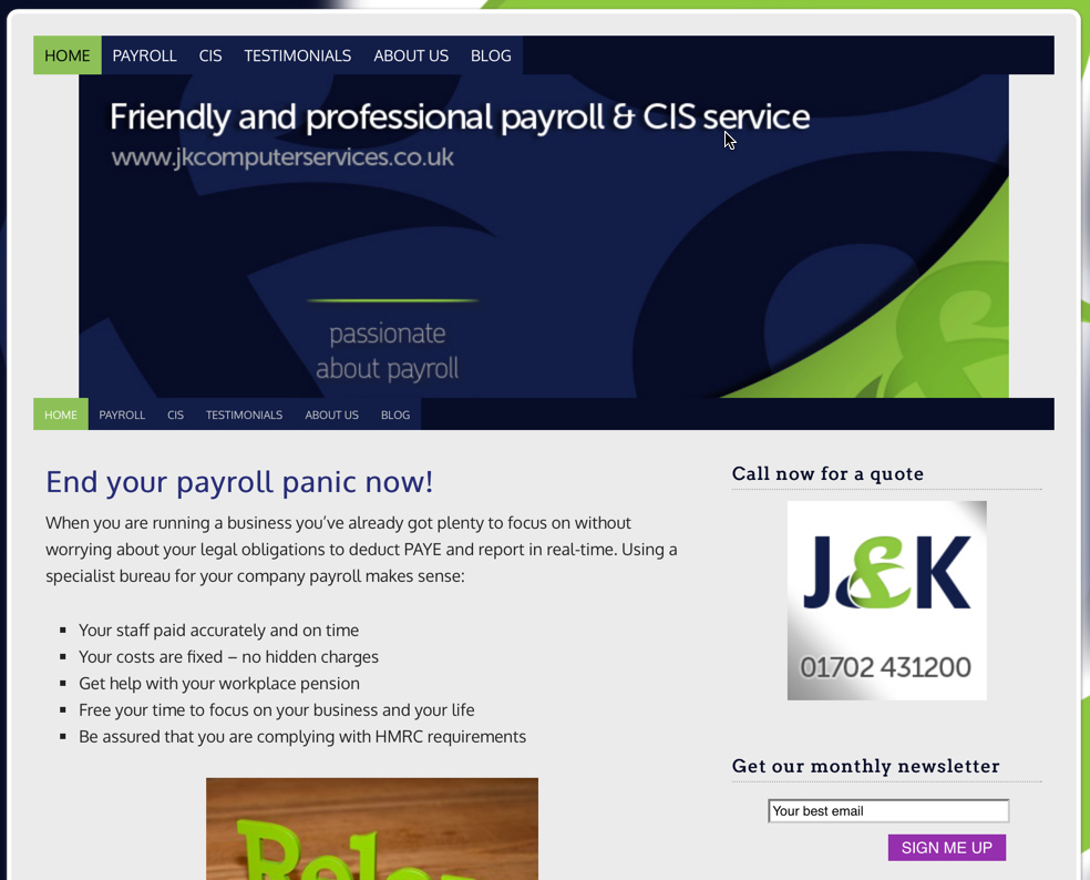
One of the pages that came in for review was a highly-reputable payroll firm:

They do a good job of outlining the problems of payroll that they solve, but while there was plenty of information about who they worked with on the About Page, it wasn’t obvious within seconds of visiting the home page who the company worked with. In this case we looked at including a few more details on the home page to show:
- The size of companies they worked with
- No. of employees
- Industries covered
- Locations covered
These 3 quick but powerful tips can make all the difference between your customer hitting that contact page, or thinking:
Shit… Click.
And we don’t want that to happen.
Did you miss the Live Copywriting Lab? Want to watch the replay? (Limited time)

Don’t worry if you missed this week’s free homepage copywriting clinic. The replay will be available until Tuesday 2nd June 2015.
Simply click here to sign up to watch the replay.
Doors to Write With Influence Open Until Weds 3rd June
For more details, click here.

Hi Amy its Cam,
I see that you ended up featuring my business “PC Medics On Call” in your webinar.
My appologies for not being present (too bad for me) but my dad had to be admitted to the hospital and in the whirlwind of everything going on I completely forgot all about this.
Once again… too bad for me! I truly do regret the fact that I wasn’t there and please do accept my apologies for not being able to attend.
P.S.. Thank you for the flattering words and do you like my design? I am the one that did the design and all of the programming.
-Cam
Hey Cam! Thanks for your comment and I hope that your dad is better, there are things much more important than webinars.
I like the liveliness of your design, it has a lot of personality. Just be careful that style doesn’t make some of the copy harder to read. I’m a lover of words (especially when they promote someone’s business) so making sure the content is easy-to-read is always my priority.
Thanks again!