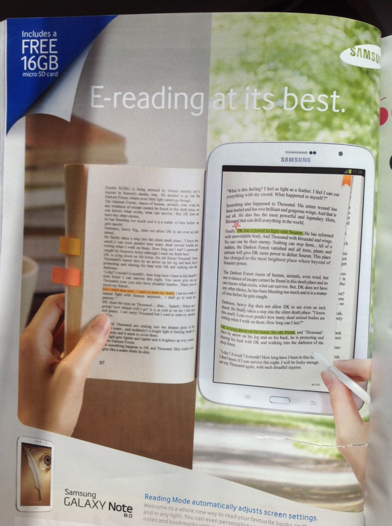
During an intense bout of copywriting research which obviously includes reading popular magazines, I came across an advert which in its simplicity is also very clever.
You might glance at the image below and think it doesn’t look like anything special.
Unless you’re someone who has thought about buying an e-reader but really prefer the experience of holding a book and scribbling notes.
If that’s the case, then this advert has targeted the message very clearly to this group, with a neat visual showing why this isn’t a problem:
- You can scribble notes in this e-reader
- You can book mark pages
- You can highlight passages
As much as I love copywriting, this one image does a powerful job of convincing those on the fence that an e-reader still has a lot of the enjoyment of a traditional book.
It does this by taking a snapshot of how the e-reader will ‘look’ in their life (and proving that it’s not that much different from an actual book).
Have a look and let me know what you think:
So how can you do this in your copywriting?
It’s the old story of “show, don’t tell.”
When I studied screenwriting, the least-compelling style of writing is using extensive dialogue to tell the audience what is happening.
Instead of having a character say how angry he is, you’d have him throw a cup at the wall instead.
It’s a simple example, but you get the picture. If people can ‘visualise’ something it stays with them longer than if they’re simply told the facts.
Fortunately using this in your copywriting doesn’t have to be complicated.
Just as in the above picture, the trick is to show your customer how your product or service is going to ‘look’ in their life.
For example. Let’s say you run an evening dance class. Instead of just telling them they’ll spend an hour learning the latest moves and keeping fit, describe what this experience ‘looks’ like:
Get ready to dance out the knots and stresses from work with this high-energy dance class. Wear your favourite comfy clothes and trainers and head to the hall where you’ll hear beats pumping and the bass shaking the floor. You’ll get a warm welcome and meet a small group of professional ladies who, just like you, are all ready to learn the hottest club moves to really tear up the town on a weekend.
Photos and videos are of course much easier to help your customer visualise, but if you don’t have those resources to hand, make sure you spend a little time painting the picture and telling your marketing story in the copy.
What do you think of the advert? Does it do a good job of showing the product in the customer’s life? Let me know in the comments below.


I think the image is great. I’m not an expert, and find it hard to get a message across in a single image that an audience will understand.
Hey Ray – thanks for commenting! What are some of the benefits of what you can help people do / achieve?
You bet they are. Check out the Nest.com home page.
Beautiful looking site!
A picture can be even more compelling than a headline.
That’s why pretty much every big name website has redesigned their site for high quality, attention-grabbing images.
Think FastCoDesign.com, INC.com, and even Google+.,
I’ve also seen home pages getting bigger and being more visually focused. Be interesting to see how it develops in the future.