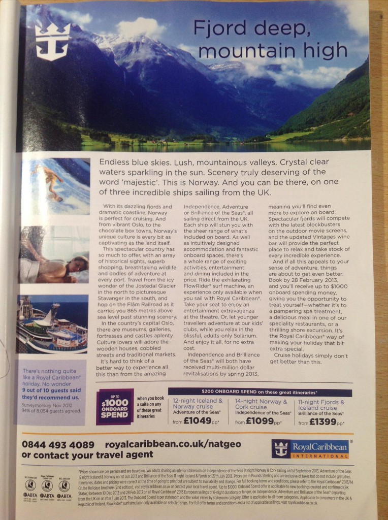
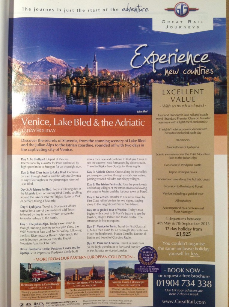
So, flipping through my National Geographic the other day I see 2 full-page travel adverts. One for a cruise, one for a rail journey. It’s not the first time I’ve used the magazine for examples of compelling copywriting.
The cruise is around £1,000 and the rail journey nearer £2,000 so not low-budget travel options.
A 4-colour full-page advert in the UK edition costs £26,010. You want to make sure you’re creating something that will catch the eye of your target market, have them read the copy, be interested and get in touch.
Let’s look at the 2 adverts and see how they compare.
Advert 1: Royal Caribbean

Here are my thoughts:
Headline
It’s a real shame the writer uses a play on words for the headline. Swapping “river deep, mountain high” for “Fjord deep, mountain high” to show, you know, that this is all about a trip to Norway.
In terms of copywriting techniques, your headlines are better if they are:
- Specific to a target audience
- Suggest a specific benefit or solution to a problem
This one doesn’t work as hard as it could to raise interests in the product which is…
What IS the offer?
You have to poke around a little while in the copy to see this is selling cruises to Norway.
When I first read this advert, I skipped the long, adjective-heavy subheading and skimmed the opening few sentences I saw:
“Norway is perfect for cruising”
I’ll be honest, and maybe it’s just my mind, but my first thought wasn’t to an actual cruise, but something seedier… which then made me chuckle but distracted me from the core message of the advert.
What’s wrong with saying:
A choice of 3 luxury cruises to explore the secret beauty of Norway
Sometimes you can over think your copywriting because is seems simple to you, but people are busy. They want something they can understand quickly.
Vague adjectives kill credibility
In a world where everything is incredible, fantastic and amazing, using too many adjectives in your copywriting can make your audience ignore your content.
It’s tempting to connect information about the product with positive describing words in the hope that your reader will see the value in what you have to offer.
In this advert we see the following descriptions:
- Dazzling fjords
- Dramatic Coastline
- Endless blue skies
- Lush, mountainous valleys
- Crystal clear waters
- Spectacular country
- Superb shopping
- Breathtaking wildlife
- Oodles of adventure
My favourite is the last one.
A lot of the copywriting in this advert is taken up by these words, and here’s the thing:
Don’t they sound like every other travel brochure?
Even down to descriptions of “cobbled streets”, “traditional markets” and “historical sites” there is nothing specific that tells me what Norway is really like. I could go visit Beverley in East Yorkshire near my hometown for cobbled streets, markets and historical sites (and a really decent sausage roll).
Formatting
The content in this advert is difficult to read.
There’s no space between the paragraphs and no subheadings making it likely that people scanning the copy will see a dense mass of words and just not read it.
Photos should give a sample of what you could enjoy, but at first glance these confused me because the top photo is of a surfer. This seems incongruent with the top picture of a calm lake and it took a while to dig into the copy to see that there is a surf machine on one of the cruise ships.
Captions, as recommended by David Ogilvy, should always be used on photos. Our eyes are naturally drawn to pictures, and a photo without a caption is a wasted opportunity to sell your offer.
Missing call to action
You’ll see at the bottom of the advert there is a number and a website url. But there is no call to action, which means the contact number doesn’t jump out at the reader.
This is simple, but at first glance it’s not clear what that number is for, which makes it very easy to ignore.
Summary – the copywriting buries the value of the product
A survey of 8,054 guests showed that 9 out of 10 people would recommend this product, so it’s probably a decent offer, a reputable company and a worthwhile trip.
Unfortunately, I think the copy covers up the selling points and makes it difficult for the reader to understand what is on offer and most importantly: why should they care?
Advert 2: Great Rail Journeys

The headline gives you the offer straight away
I do like the simplicity of the headline. You know it’s a holiday, you know how long for, and the logo top right for Great Rail Journeys lets you know it’s going to be rail-based.
The subheading is also specific and reinforces the message of the headline. You know exactly what’s involved.
Formatting
Aesthetically, this is much better layout for a full-page advertisement. There is enough content there to give you information about the trip, and it is nicely formatted as a day-to-day itinerary.
Breaking up the content this way makes it very easy to dip in and out and the language is specific enough that you can imagine what the journey will be like.
The use of a sidebar – highlighting the selling points
The righthand gold strip pulls out the high-level summary details of the offer. You can see, at-a-glance, what is involved, the departure dates, and the cost of the trip.
This is a deliberate way to prove the value of what’s included in the price, with the nice additional reminder that:
You couldn’t organise the same inclusive holiday yourself for less.
Perhaps a little accusatory in tone, but it does give you their Unique Selling Point.
Clear Call to Action:
Bottom right corner, right after you’ve read the copy are clear instruction on how to book, or request a free brochure, and letting you know that:
“Our UK tour advisors are here 7 days a week”
A little more encouraging than the previous advert’s suggestion that you just “contact your travel agent”
Summary
Overall, I believe this is a much better advert than the Royal Caribbean offering. It’s been carefully presented, and the copy placement has been designed thinking about how the audience will read the advert in real life: scanning and wanting the most important information quickly.
After looking at the adverts would you agree or disagree? Do you have any other comments on how these adverts worked for their £26,010 placement? Let me know in the comments… Oh, and if you see that Tweet button at the top of this article, give it a good old click will you? Thanks!

Leave a Reply